MIDI Designer Reference Manual
Sidebar
Table of Contents
Chapter 5: Working with Controls
You work with controls in Design Mode. See how to enter Design Mode.
There are two types of controls in MD:
- Dynamic Controls like buttons, knobs, and XY pads
- Decorative Controls like labels and shapes.
This chapters discusses how to create, copy, and duplicate controls, and set up your layout.
Types of Controls
Buttons
By default, a button has two states, on or off (subtype is “toggle”). Buttons can also be momentary (no latch) and have variable velocity as Drumpads.
Buttons can show text, either single line or multiline.
There are a variety of options for varying the appearance of buttons. They can also assume a variety of different shapes including piano keys.

Piano Keys

Piano Keys (Different)
Isomorphic Keys

Regular Buttons
Variable Controls
Knob, Slider, Crossfader, XY Pad
We'll use Variable Controls to refer to knob, slider, crossfader and the X or Y dimension of an XY Pad.
Knob
- Displays Values: Rotary (clockwise increasing)
- Movement: Up-Down by default

An MD Layout
Slider
- Displays Values: Vertical (up increasing)
- Movement: Up-Down by default
Crossfader
A crossfader is essentially a slider with horizontal control.
- Displays Values: Horizontal (right increasing)
- Movement: Left-Right by default
XY Pad
- Two dimensions (X and Y)
- Displays: two values, one for each dimension
Decorative Controls
These do not send and receive MIDI data all types of controls that are for display only.

Decorative Controls (with some knobs)
- Label: Displays a word or phrase of up to 40 characters. The size of the control determines the size of the text.
- Multiline Label: Displays a paragraph or multi line description.
- Shape: Displays a line. Good for visually separating different functionality in your layout.
- Panel: Creates a colored box with adjustable color, transparency, and patterned text.
Add a Control
Adding controls is quick and easy.
Add Control Pane (iPad)

Add Control Pane
- Tap any blank space on the page to bring up the the Add Control Pane then select the type of control you wish to add.
- Add 1, 4 or 8 controls at a time.
- Make the “Add Pane” sticky by pressing the Red LED in the upper left hand side.
Add Control Pane (iPhone)

- Press + in top menu to bring up the Drag to Add Control panel
- Drag the desired control type to the page
- When finished adding controls, tap + or swipe right to close the pane
Size and Position a Control
- A single-tap on a control displays its red bounding box and sizing handles.
- Drag the handles or use pinch-and-zoom to size a control and change its shape.
- Drag the control to reposition it.
- You may also use the Size Slider and Change Aspect buttons (see below)
Move Controls to Other Pages (iPad/Mac) — Drag a control to move it to another page.
If you are using One Big Page, you might not be able to get the source and target pages on the screen simultaneously. In these situations, temporarily turn One Big Page to OFF.
Move Controls to Other Pages (iPhone) — select the control, then move the control to other pages using the arrows on the toolbar.

Layering controls visually
- Send to back: Control Properties Pane → Actions → Send to back.
- Bring forwards: when you touch a control in design mode, it is automatically brought to the front of all other controls on the page.
Bring to Front?
As there is no “bring to front” button, you might need to send some controls backwards to bring the control you need to the front.
Panels
Panels always move to the back of other controls. To layer panels
on other panels, you might have to use Send to Back
Access the Control Properties Pane
Double-tap a control to access the Control Properties Pane
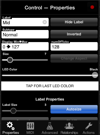
Control Properties Pane, iPad
Display properties of controls are modified in Control Properties Pane → Properties Tab. Here you can change the colors of a specific part of your layout, of specific controls, and add labels. In general, the Display Properties do not change the types of messages sent by controls, however:
- The number of ticks can limit the values of MIDI messages can be sent out by a control. For example, a knob that sends a Control Change and has three ticks can only send three discrete values.
- Named Ticks – an advanced feature – tie the MIDI values to specific display values.
The Control Properties Pane is context sensitive: different types of controls have different modifiable properties.
Delete a Control
Control Properties Pane → Actions → Delete. A prompt appears: confirm to delete the control.
Adjust Display Properties
Access Display Properties from the Control Properties Pane
- The leftmost tab, called Properties, refers to the Display Properties of the selected control.
- For XY Pad: Access an XY pad's properties per dimension. Switch dimensions by pressing “Design Y Dimension” or “Design X Dimension”
Size Slider — This slider changes the size of the affected control, maintaining its current aspect-ratio.
Change Aspect — Changes the aspect ratio of the control. Provides more limited choices than manipulating the control directly with the sizing handles, thereby permitting greater efficiency.
LED color — Adjusting the LED color slider changes the hue of the LED color used in the control.
- The first LED color value is Page – this value indicates that the control takes the page-wide LED color
- Values then range from 2-256, and skip by 2's. These values are the hue of the LED color going from red to red.
- The last two values to the right are White and Black.
- Be sure to see Value Lock for Sliders just below, which will help you hit specific numbers.
- Below the LED slider, there is an area that says Tap for Last LED Color – this is a great way to ensure consistency between the LED colors for controls.
In general, unless you have a clear, functional reason for using LED colors for controls,
you should prefer page-wide LED colors.
Consistency in design will make your layout look better (and you'll be looking at it a lot).
Value Lock for Sliders — In Design Mode, all sliders are equipped with a value lock. If you stop moving your touch for half a second, the sliders locks in place. Then, you can lift up your finger without altering the value.
Labeling Controls
Label — Typing in this field will change the name displayed in the name label
- Knobs, Sliders, Crossfaders: Name label is displayed under the control
- Buttons: Name label is displayed inside the button
- Labels: Name label is the label
- Panels: Name label is displayed in a repeating pattern on the panel
(Other) Label Properties

Label Properties
Hide Label (Toggle) — When ON, the label is not shown. You may also hide the label by putting in a blank label but the Hide Toggle allows you keep the label and avoid confusion in Design Mode.
Label Size — Change the size of the label of the selected control:
- Label sizes are consistent: a Label Size of 4 will look the same for a Knob as for a Button, for instance.
- The value for this slider is automatically adjusted unless the Autosize button is turned OFF.
Autosize (Toggle) — When turned ON, the Label Size slider is set automatically based on the selected control's size.
For Controls of Type Label
Autosize may not be set to OFF. Size the selected Label control itself to achieve the text size you need.
Supersize (Toggle) — When ON, the indicated label size for the selected control is about 50% larger.
Multiline (Toggle) — Changes a label to display on multiple lines. If the label text is too short (or the size too small), the display will only show one line.
For Controls of Type Label
You must use a Multiline Label or a Label Control. You cannot change between them using the Multiline Toggle.

Various Label Sizes
Min, Max and Ticks
Variable Controls Only — Variable controls refer to knob, slider, crossfader and XY pad.
Display Min -> Max
The Display Min → Max adjusts the minimum and maximum numbers a controls displays on your iOS device.
- However, it does not change the MIDI data that is being sent.
- Example: MIDI range for a Slider called “Volume” is 0→127. Change display Min→Max to 1→10. When the knob displays 1 on the display, the knob sends 0, but the knob
- Inverted Example: MIDI range for Slider called “Rate” is 0→127. Change Display Min→Max to 100→1. When the knob shows 100, the knob sends 0. When the knob shows 1, it sends 127.
Number of Ticks
Change the number of ticks (or steps) a control has, which is the number of discrete values the control can send out.
- Changing the ticks of a knob to three, will restrict the behavior of that knob to three positions.
- Changing the number of ticks changes the MIDI messages sent by skipping certain values
- For more control, you can use Named Ticks. Named Ticks
Display Options (Buttons and Shapes only)
Display Options change the shape or orientation of Buttons and Shapes.
Display Options for Buttons
- Normal — A rectangular button with rounded corners.
- Always Lit — A rectangular button that shows its color in a lighter tone when its on, and darker tone when its off.
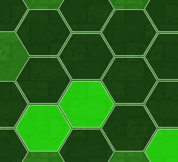
- Hexagonal — A hexagonal shaped button. These are great for constructing isomorphic keyboards.
- Hex (Always Lit) — A hexagonal shaped button that shows its color in a lighter tone when its on, and darker tone when its off.
- Round — A circular button.
- Round (Always Lit) — A circular button that shows its color in a lighter tone when its on, and darker tone when its off.
- Piano Key — Displays a long button shaped like a piano key.
- Piano C/F — A piano key with a space for a black key on the right side.
- Piano E/G/A — A piano key with a space for a black key on both sides.
- Piano E/B — A piano key with a space for a black key on the left side.
- Piano Sharp/Flat — A black piano key.
Display Options for Shapes
Currently the only shape available in MD is a bar or line. By adjusting the thickness this can also act as a box.
- Horizontal top — Place the bar horizontally along the top of the bounding box.
- Horizontal middle — Place the bar horizontally in the middle of the bounding box.
- Horizontal bottom — Place the bar horizontally along the bottom of the bounding box.
- Vertical Left — Place the bar vertically along the left side of the bounding box.
- Vertical Middle — Place the bar vertically along the middle of the bounding box.
- Vertical right — Place the bar vertically along the right side of the bounding box.
Alpha Slider (Panels and Shapes Only)
Adjusts the transparency of the control, or some part of the control's display.
Design Locks
iPad-only — When designing visually complex layouts in MD, you might run into the following situations:
- You cannot select one control because another control is on top of it
- You cannot add controls to a space that has a Panel, because the Panel gets selected instead

Design Lock Icon
Design Locks were created in response to these difficulties. The Design Locks are accessed through the lock icon to the right of the Exit Design Mode button.
There are four options with Design Locks:
- Lock Panels — When this lock is ON, you cannot select controls of type Panel
- Lock Labels — When this lock is ON, you cannot select controls of type Label. This does not affect controls of other types that have a Label, such as Knob.
- Lock Shapes — When this lock is ON, you cannot select controls of type Shape (lines)
- Lock Others — When this lock is ON, you cannot select all other controls.

Design Locks (All Off)

Design Locks (One Off)
Basic Control Behaviors
Subtypes for Sliders, Knobs, Crossfaders
Control Properties Pane → Properties → Subtype
There are only two basic subtypes for these controls:
- Normal: The control sends a variable MIDI message from your MIDI Min to your MIDI Max (or the reverse) depending on the location of your touch.
- Relative: the control sends one MIDI message if going upwards, and another when going downwards.
These other subtypes will be discussed later: Transpose, Octave Transpose, Presets, Channel Changer and Channel Changer + Presets
Other Options for Sliders, Knobs, Crossfaders
Aside from subtypes, control's have basic options, including Display and Label Properties as discussed above.
Inverted
- normally knobs and sliders go up (increase) and down (decrease)
- normally crossfaders go right (increase) and left (decrease)
- inverted knobs and slider go up (decrease) and down (increase)
- inverted crossfaders go right (decrease) and left (increase)
Both the X and Y dimensions of an XY Pad can be inverted as well.
Inverting a control may seem odd. Instead, you want to:
- Invert its output. Do this by setting a lower MIDI max than the MIDI min.
- Invert the numbers displayed: do this by adjusting Display MIN and MAX as seen above
Rotate Touch Axis
Control Properties Pane → Advanced → Rotate Touch Axis
- Controls that normally go up and down now go right and left (1/4 turn clockwise)
- Controls that normally go right and left go up and down (1/4 turn counter-clockwise)
Long Throw
Control Properties Pane → Advanced → Long Throw
Long Throw controls go through a control's range more slowly, offering better precision.
The Throw Length is how far you have to move your touch to get the control to traverse its entire range.
Ribbon Strip
Control Properties Pane → Advanced → Ribbon Strip
Normally, wherever you touch a slider or crossfader is the control's current value. Then, your touch goes up and down (or left and right) from there, to increase or decrease values.
When a slider is set to “Ribbon Strip,” you touch an absolute value on the slider or crossfader:
- Touching the very top of the slider (or right of a crossfader) always sends the MAX value
- Touching the bottom (or left) always sends the MIN value
XY Pads act as ribbon strips in two dimensions, essentially.
Subtypes for Buttons
Control Properties Pane → Properties → Subtype
Toggle
The button requires one press to send its MIDI ON value, and another press to send its MIDI OFF value.
Momentary
If the button is pressed, it sends its MIDI ON value. On release, it sends its MIDI OFF value.
Drumpad
- Tall buttons are louder the higher you touch them
- Wide buttons are louder the further to the right you touch them
- Square buttons are louder in the middle
Real MIDI Off Values
By default, drumpads use about 66% of your MIDI range. You can also have them go through your full MIDI range.
Use Design Properties → Advanced → Real MIDI Off Values

Full MIDI Range
Panic Button
The Panic Button sends a Note Off for all notes on all channels to all MIDI targets.
You can also use MIDI messages for a Panic Button. Depending on your MIDI target, this might work better: fewer MIDI messages sent and the MIDI target can optimize its response.

Alternatives to Panic Button in MIDI Designer
On the other hand, your MIDI target could also ignore these messages or just use them as regular control change messages.
Other Subtypes
Other subtypes are described elsewhere:
Page-Wide Control Actions
Access page-wide control actions from the Page Properties Pane → Controls:

Page Properties Pane → Controls
Renumbering Controls and Changing Channels
Hit Renumber Controls (Channel/CC) to see the Renumber Controls Pane.

Renumber Controls Pane
Choose your starting channel and (optionally) your starting CC. Then choose one of three actions:
- Sequential: Renumbers Channel & CC for all controls on the page, sequentially from the starting channel and CC. This might create controls that overlap with Channel-CC combinations used elsewhere in your layout.
- Channel Only: Changes only the channel of all controls on the page.
- Unused: Renumbers Channel & CC for all controls on the page, starting from the starting channel and CC. MD will not use Channel-CC combinations that are used elsewhere in your layout.
Note: MD will renumber controls with most MIDI message types, including:
- Control Change
- Note On/On-Off
- NRPN (MSB only)
- Pitch Bend (Channel Only)
Reset Page to Default Template
Hit Reset Page to Default Template to have MD build a common page format:

Default Page Tetmplate
This feature automatically assigns Channel-CC to avoid overlap.
Delete All Controls
Hit Delete All Controls to delete all controls on a page. You be prompted to confirm.
Remove Custom Colors
Hit Remove Custom (Control) Colors to remove control-specific LED colors and alpha settings. You will be prompted to confirm. These colors are set here in Display Properties and alpha is set here.
Lock Layout (Toggle)
Lock Layout is a toggle button. It is OFF by default.
- When ON, controls cannot be moved or sized on the selected page.
- When OFF, controls can be moved or sized as usual.
manual/05_controls.txt · Last modified: by 127.0.0.1
Except where otherwise noted, content on this wiki is licensed under the following license: CC Attribution-Share Alike 4.0 International
